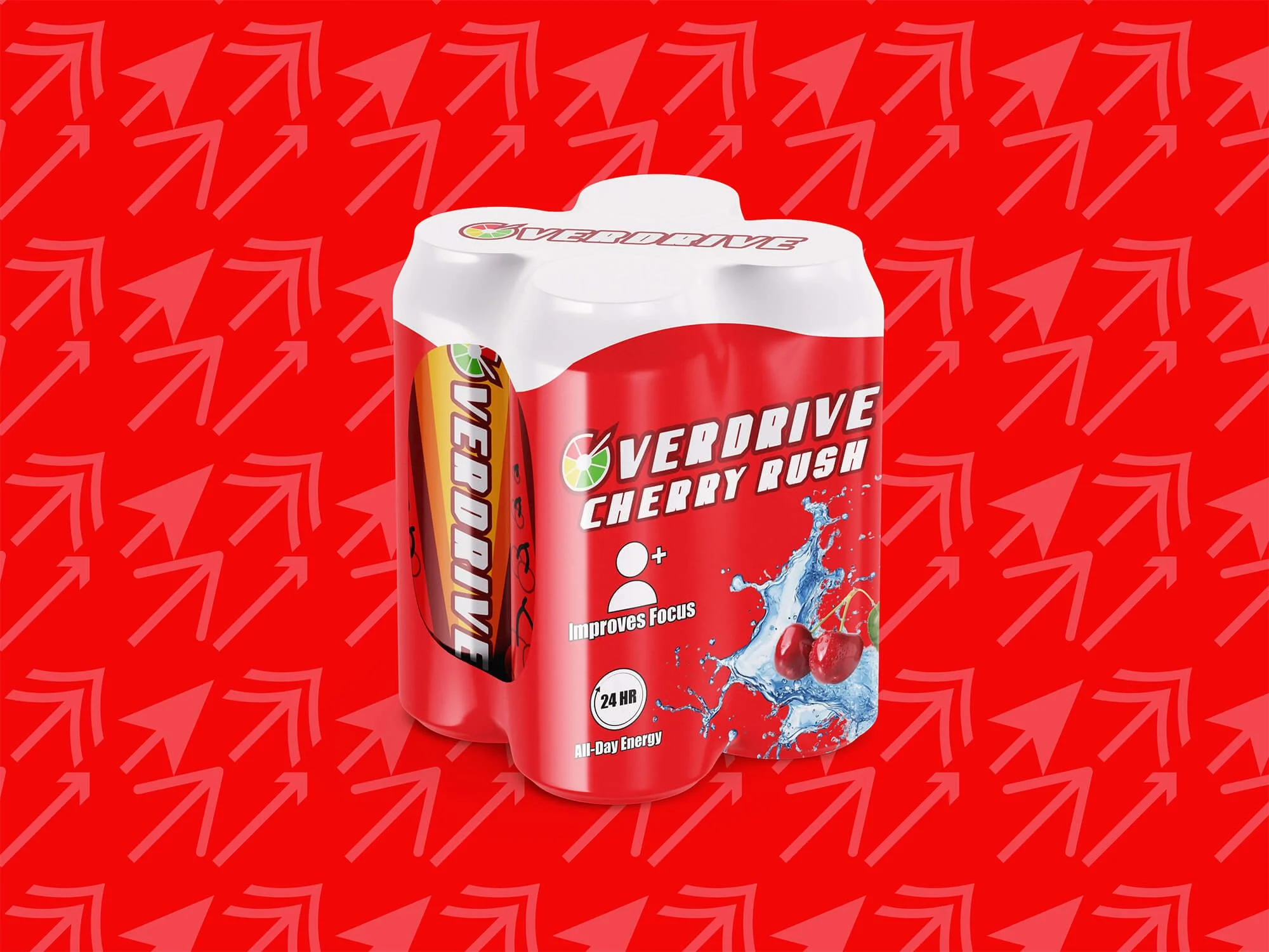
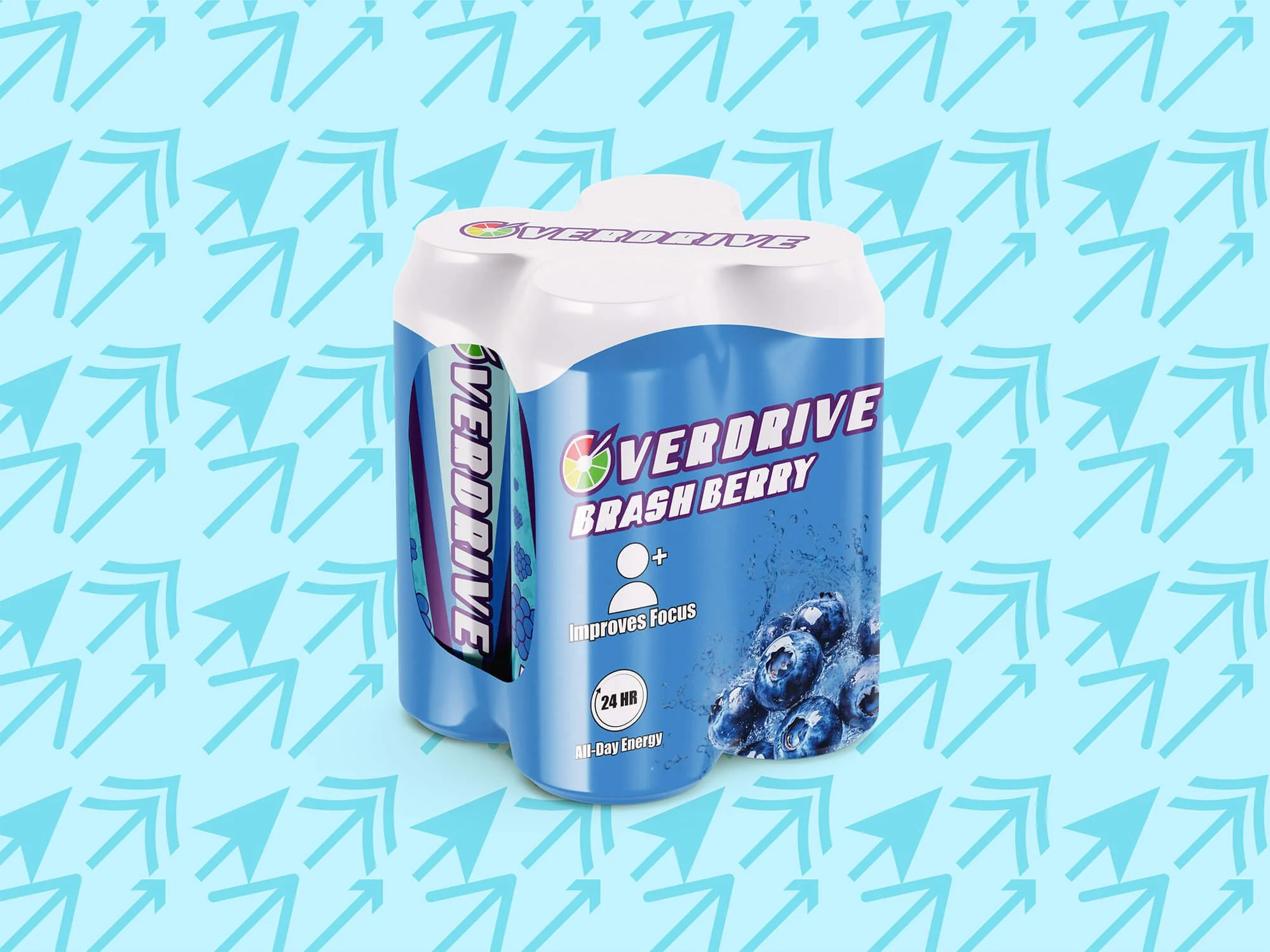
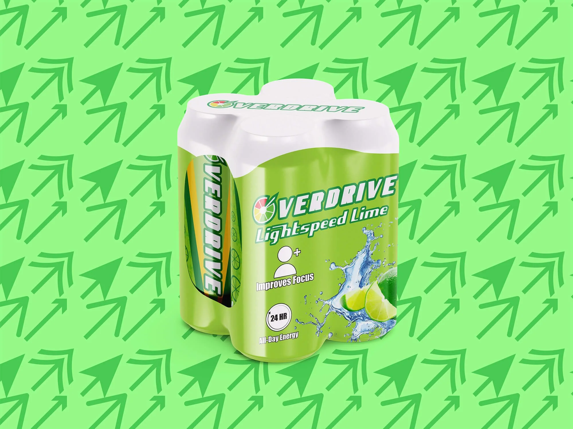
Overdrive Energy Design
I used themes of speed gauges and arrows to emphasize the idea of speed that the name “Overdrive” provides. The flavors I picked are ones that I would appeal to the broadest audiences. Putting the graphics of the fruit on the can helps to better show the flavor of the drink. The pattern in the background of the can makes it more visually appealing and would add texture to the surface of the can to make it more tactilely appealing as well.